Exploratory Data Analysis - EDA
Gathering, Cleaning, & Exploration
Data Sources
For this project data has been collected from four different web sources.
-
Migraine Clinical Studies - ClinicalTrials.gov API
-
Migraine TOS - Harvard
-
Migraine Dataset - Kaggle
The ClinicalTrials.gov dataset contains 500 records of clinical trials in various stages of research phases.
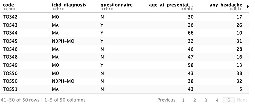
The Harvard dataset contains extensive records about migraine locations, age when diagnosed, risk factors, MRI and CT record results, symptoms, and medications taken for 51 patients.
The Kaggle dataset contains data on patient symptoms experienced during a migrainous episode along with age.
These three different datasets contain valuable information regarding proposed questions and hopefully will shed light into migraines and further understanding of this disease.
Data Cleaning
Kaggle Data Set
The Kaggle dataset did need some minor adjustments and cleaning. There were no null records, no missing values, and all categorical values were identically matching text, there were no weird fill-in-the-blank type values. When reading in the csv, R converted all 1-0 values to be dbl type so those were converted back to int. Column names were named meaningfully and did not add any extra complexity to understanding the data.


ClinicalTrials.gov Data Set
The ClinicalTrials.gov data set came from the API hosted on the group's website. For the project, the endpoint for studies is being used.

A look at the raw data, it's breathtakingingly beautiful!
There were quite a lot of data columns returned that were unnecessary for the research questions posed on the introduction slide and contained numerous null values. For this project's sake, those columns were dropped as they did not add any value to the table and data visualizations. There were 146 unique columns initially in this data set and tables had multiple words with multiple sectioned names. For readability, those names were stripped off and all that remains is just the rightmost portion of text.
After the drop and renaming, there are 48 columns of data about migraine-related clinical studies. There are still some null values in secondary fields, but that should not affect the data being pulled.

Just look at those long column names, YIKES!

Much improved, looks much cleaner.
Harvard Data Set
The Harvard data set had an extensive history of patients suffering from chronic migraines. There is tons of information on prescriptions, migraine locations, MRI and CT scan results, and other great unidentified HIPAA compliant clinical data.

On initial exploration, data looks good. Column names not so much.
For the cleaning portion of this data set, the data columns were renamed to not have spaces in between words.
Much improved!
Visualization #1

Figure 1 shows the current status of 500 migraine clinical trials. Roughly 280 of these trials are closed, 75 are actively recruiting, and then the rest fall under various statuses like withdrawn, terminated, etc.
This figure was created to see the classification of clinical trials so the conclusions drawn about them would be applied correctly.
Visualization #2a 2b

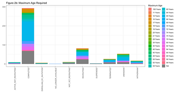
Figures 2a and 2b show both the minimum and maximum age required for the clinical trials based on their status.
For the minimum age, most studies required the participants to be 16-18 years of age to participate.
For the maximum age, most studies required participants to be no older than 65-70 years of age.
It is interesting to see the maximum age at 65. Intuitively, it would make sense to cut the age to 65 due to complications in older adults that may potentially skew data sets. However, valuable data still could be found if they were to be included.
These figures were made to get a better understanding of where the age groupings should be drawn for future analysis, which is 18-65.
Visualization #3
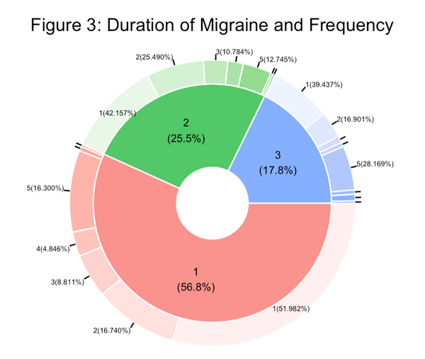
Figure 3 shows data from the Kaggle set by taking the Duration in days as the inner ring of the pie chart and the frequency of days in the outer ring.
A majority, ~57% of patients have a duration of 1 day, ~25% have a duration of two, and the final ~18% have a duration of 3 days.
Upon further examination, migraines trend in all three durations to either frequent for 1-2 times or 5 times. The polar extremes of each other.
Visualization #4


Figure 4 shows data from the Kaggle set by grouping the ages and turning it into a density plot.
Upon review, the data set is heavily skewed below the mean (black line) of 31.705 however there is hardly any patients who belong to that bucket. There are quite a lot of older patients who balance out and bring the average higher.
The youngest patient in the data set is 15 years old and the oldest patient in the data set is 77 years old.
This confirms what was seen in Visualization #2 with clinical trials being roughly from ages 18-25 with a few outliers.
Visualization #5


Figure 5 shows a box plot summary from the Kaggle data set of the intensity scores given by patients.
From this visualization, the minimum score given for intensity pain is 0, the median intensity pain is 3, and the average intensity pain is 2.47.
Surprisingly, the intensity scores are not as high.
Visualization #6


Figure 6 shows a histogram breakdown of the BMI scores of all 50 patients in the Harvard data set.
From this visualization, the minimum BMI is 15.19, the maximum BMI is 58, and the average BMI is 30.75.
Interestingly, the BMI results tend to center around the mid-20s but due to the few very high BMI scores, it is pushing the mean further to the right. Similar to the behavior seen in Figure 4
Visualization #7

Figure 7 the comparison of the duration of care in days concerning years from the Harvard data set.
From this visualization, it can be discerned that there are three distinct clusters. The first being 0-150 days, the second being from 300-725 days, and the third being from 750-1000+ days
It is a good mix of patients and should provide some valuable insights with further machine-learning techniques.
Visualization #8

Figure 8 shows the top 6 most prescribed medications to chronic migraine sufferers from the Harvard data set.
The top 6 medications are topiramate, botox, amlodipine, propranolol, gabapentin, and amitriptyline.
These medications are commonly given to migraine patients. They vary in class from tricyclic antidepressants to anti-seizure drugs.
Visualization #9

Figure 9 shows the different types of pulse classifications and how each patient was recorded.
It looks like 50% of patients had normal pulses and the other 50% fell into an unnormal pulse classification.
Additionally, the largest abnormal pulse deviation was in the weak, bilateral category, meaning both sides of the brain were registering a weak pulse.
Visualization #10

Figure 10 shows if a patient has vertigo on the inner ring and if they have vision loss on the outer ring.
54% of patients fall into having vertigo and 46% fall into unknown or unsure.
From there, of those 54%, 33% experience vision loss. About 15% experience Ipsi or ipsilateral vision loss, meaning "same side" as the migraine is on. And another ~4% have diplopia which is the medical term for double vision.
It is strange that those who do not get vertigo lose their vision at a pretty high rate, almost 50%!